Angular Highcharts - 配置语法
在本章中,我们将展示使用 Angular 中的 Highcharts API 绘制图表所需的配置。
第 1 步 - 创建 Angular 应用程序
按照以下步骤更新我们在Angular 6 - 项目设置章节中创建的 Angular 应用程序 −
| 步骤 | 说明 |
|---|---|
| 1 | 创建一个名为 highchartsApp 的项目,如Angular 6 - 项目设置章节中所述。 |
| 2 | 修改 app.module.ts、app.component.ts 和 app.component.html,如下所述。 保持其余文件不变。 |
| 3 | 编译并运行应用程序以验证实现逻辑的结果。 |
以下是修改后的模块描述符app.module.ts的内容。
import { BrowserModule } from '@angular/platform-browser';
import { NgModule } from '@angular/core';
import { AppComponent } from './app.component';
import { HighchartsChartComponent } from 'highcharts-angular';
@NgModule({
   declarations: [
      AppComponent,
      HighchartsChartComponent
   ],
   imports: [
      BrowserModule,
   ],
   providers: [],
   bootstrap: [AppComponent]
})
export class AppModule { }
以下是修改后的HTML主机文件app.component.html的内容。
<highcharts-chart
   [Highcharts] = "highcharts"
   [options] = "chartOptions"
   style = "width: 100%; height: 400px; display: block;">
</highcharts-chart>
在了解配置后,我们最终会看到更新后的 app.component.ts。
步骤 2 − 使用配置
创建 Highcharts 并创建图表选项
highcharts = Highcharts;
   chartOptions = {
}
创建图表
使用chartOptions配置图表的类型、标题和副标题。
chart: {
   type: "spline"
},
x 轴
使用图表选项配置要在 X 轴上显示的股票代码。
xAxis:{
   categories:["Jan", "Feb", "Mar", "Apr", "May", "Jun", "Jul", "Aug", "Sep", "Oct", "Nov", "Dec"]
},
y 轴
使用图表选项配置要在 Y 轴上显示的标题。
yAxis: {
   title:{
      text:"Temperature °C"
   }
},
工具提示
配置工具提示。 使用图表选项将后缀添加到值(y 轴)之后。
tooltip: {
   valueSuffix:" °C"
},
系列
使用chartOptions配置要在图表上显示的数据。 Series 系列是一个数组,其中该数组的每个元素代表图表上的一条线。
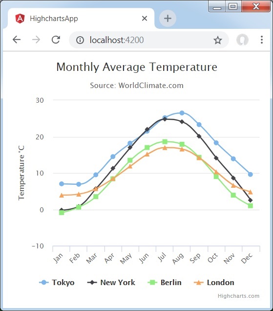
series: [
   {
      name: 'Tokyo',
      data: [7.0, 6.9, 9.5, 14.5, 18.2, 21.5, 25.2,26.5, 23.3, 18.3, 13.9, 9.6]
   },
   {
      name: 'New York',
      data: [-0.2, 0.8, 5.7, 11.3, 17.0, 22.0, 24.8,24.1, 20.1, 14.1, 8.6, 2.5]
   },
   {
      name: 'Berlin',
      data: [-0.9, 0.6, 3.5, 8.4, 13.5, 17.0, 18.6, 17.9, 14.3, 9.0, 3.9, 1.0]
   },
   {
      name: 'London',
      data: [3.9, 4.2, 5.7, 8.5, 11.9, 15.2, 17.0, 16.6, 14.2, 10.3, 6.6, 4.8]
   }
]
示例
考虑以下示例以进一步理解配置语法 −
app.component.ts
import { Component } from '@angular/core';
import * as Highcharts from 'highcharts';
@Component({
   selector: 'app-root',
   templateUrl: './app.component.html',
   styleUrls: ['./app.component.css']
})
export class AppComponent {
   highcharts = Highcharts;
   chartOptions = {
      chart: {
         type: "spline"
      },
      title: {
         text: "月平均气温"
      },
      subtitle: {
         text: "Source: WorldClimate.com"
      },
      xAxis:{
         categories:["Jan", "Feb", "Mar", "Apr", "May", "Jun",
            "Jul", "Aug", "Sep", "Oct", "Nov", "Dec"]
      },
      yAxis: {
         title:{
            text:"Temperature °C"
         }
      },
      tooltip: {
         valueSuffix:" °C"
      },
      series: [
         {
            name: 'Tokyo',
            data: [7.0, 6.9, 9.5, 14.5, 18.2, 21.5, 25.2,26.5, 23.3, 18.3, 13.9, 9.6]
         },
         {
            name: 'New York',
            data: [-0.2, 0.8, 5.7, 11.3, 17.0, 22.0, 24.8,24.1, 20.1, 14.1, 8.6, 2.5]
         },
         {
            name: 'Berlin',
            data: [-0.9, 0.6, 3.5, 8.4, 13.5, 17.0, 18.6, 17.9, 14.3, 9.0, 3.9, 1.0]
         },
         {
            name: 'London',
            data: [3.9, 4.2, 5.7, 8.5, 11.9, 15.2, 17.0, 16.6, 14.2, 10.3, 6.6, 4.8]
         }
      ]
   };
}
Result
验证结果。