NumPy - 使用 Matplotlib 的直方图
NumPy 有一个 numpy.histogram() 函数,它是数据频率分布的图形表示。 水平大小相等的矩形对应于称为 bin 的类间隔,可变高度 对应于频率。
numpy.histogram()
numpy.histogram() 函数将输入数组和 bins 作为两个参数。 bin 数组中的连续元素充当每个 bin 的边界。
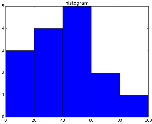
import numpy as np

a = np.array([22,87,5,43,56,73,55,54,11,20,51,5,79,31,27])
np.histogram(a,bins = [0,20,40,60,80,100])
hist,bins = np.histogram(a,bins = [0,20,40,60,80,100])
print hist
print bins
它将产生以下输出 −
[3 4 5 2 1]
[0 20 40 60 80 100]
plt()
Matplotlib 可以将直方图的这种数字表示形式转换为图形。 pyplot 子模块的plt() 函数 将包含数据的数组和bin 数组作为参数,并转换为直方图。
from matplotlib import pyplot as plt
import numpy as np

a = np.array([22,87,5,43,56,73,55,54,11,20,51,5,79,31,27])
plt.hist(a, bins = [0,20,40,60,80,100])
plt.title("histogram")
plt.show()
它应该产生以下输出 −